Creating your own email templates offers a powerful way to elevate your email marketing strategy. With custom templates, you ensure that every email consistently reflects your brand’s identity while streamlining your workflow.
With Jackrabbit's email template editor, you can customize every aspect of the email, from the layout to the content and images!
- Ensure consistent and professional branding.
- Save time with reusable designs.
- Enhance engagement with personalized communications.
The Email Template Editor - An Overview
Jackrabbit's email template editor simplifies the process of creating stunning emails, making it as easy as building with blocks. No technical expertise is required—just drag, drop, and customize to bring your vision to life!
Rows, columns, and content blocks are the foundation of your email design. They are added to the main workspace, called the canvas, where you'll build your content.
- Rows are horizontal sections that divide your email into different parts, like headers, content areas, and footers.
- Columns are vertical divisions within a row that help you organize content side by side, such as placing text next to an image.
- Content blocks are individual elements you place in columns, such as text, images, and buttons. Each block can be customized to fit your design.

The image above displays a single row on the canvas with one column containing two content blocks.
Your design 'toolkit' is located in a side panel with several tabs. Each tab provides access to the tools you'll use to build your email. You can collapse the side panel to increase your canvas working space.

Content
The Content tab provides access to various content blocks you can use to build your email. Drag and drop these blocks into rows on your canvas to create and organize your content.

- Columns - Add columns to your design.
- Attach File - Add a link to a Jackrabbit file.
- Button - Add any type of button in your email, controlling color and style.
- Divider - Use to add spacing and division between sections in your email.
- Heading - Add headings (from levels 1-6).
- Text - Add a block of text.
- Image - Add an image (uploaded or stock) to your email.
- Google Drive - Add a link to a file in Google Drive.
- Menu - Used to create navigation menus.
- HTML - Add a block to the design in code.
Blocks (structure)
Add a new row with your chosen number of columns by dragging a block above or below an existing row on the canvas.

Body
The Body tab includes options related to the overall design and layout of the email body, such as text color, background color, content width (max 900px), and more.

Images
Search through literally millions of stock images to drag and drop into your design.

Audit
The Audit tab alerts you to any issues in your design and content, e.g., missing alternate text (accessibility).

Create a Template from Scratch
To create a new template, click the Gear icon, select Settings, and select Email Templates. On the List Templates page, select the Add Template button to open the classic template editor. To create your template using the drag-and-drop functionality, select Try New Editor.
Let's step through creating a simple newsletter template to get the gist of it. As you get comfortable in the template editor, you'll be able to create more customized designs.
Create the Layout
The newsletter will have a logo, heading, divider, two columns of side by side text, and a footer with a divider and a call to action button.
The first step is to lay out the email by adding rows and content blocks to the canvas. When initially creating the template, the first row has already been added to the canvas for you.
- In the side panel, select the Image content block and drag and drop it in the row. A blue line indicates where the block will be dropped.
- Drag the Heading content block and drop it when the blue Drag it here line is below the image. The heading will be added to the row below the image.
- Add the divider line. Because we want it to go the full width of the newsletter, we can drop the Divider content block into the row directly below the heading. This completes the first row.
- Add text blocks. We are going to use a side by side, two-column design. We'll need to create a new row to be able to divide it into two columns. There are three options to add the new row:
- Select the Columns content block and drag it onto the canvas below the first row. Drop it and select the two-column layout in the side panel.
- Go to the Blocks tab, select the two-column layout, and drag it onto the canvas below the first row.
- Use the bottom Add Row option (available when you hover or highlight a row) to add a new row below the first one. Then highlight the row to open the row options and select two columns.
- Select the Text content block and drag and drop it into the first column. Drag and drop another Text block into the second column.
- Because we want the last row to extend the full width, we must create a new row below our two text columns. There are two options to add a new row:
- Go to the Blocks tab, select the one-column layout, and drag it onto the canvas below the second row.
- Use the bottom Add Row option (available when you hover or highlight a row) to add a new row below.
- Select the Divider content block and drag it into the last row. Then drag the Button content block directly below it.
 |
Our layout is now ready to be customized!
Customize Your Content
Now that we have our newsletter laid out, we'll customize the content blocks.
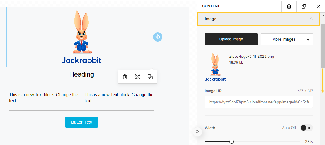
- On the canvas, click on the Image content block to open the image options in the side panel. There, you can choose to upload an image or search the stock photo library supplied for an image to use. Once the image has been selected, use the image options available to make edits like sizing, alignment, etc.

- Click on the Heading content block to open the text options. Select the Heading Type and font preferences, such as size, weight, color, etc.
- Customize the width, weight, and color of the Divider content block using the side panel options.
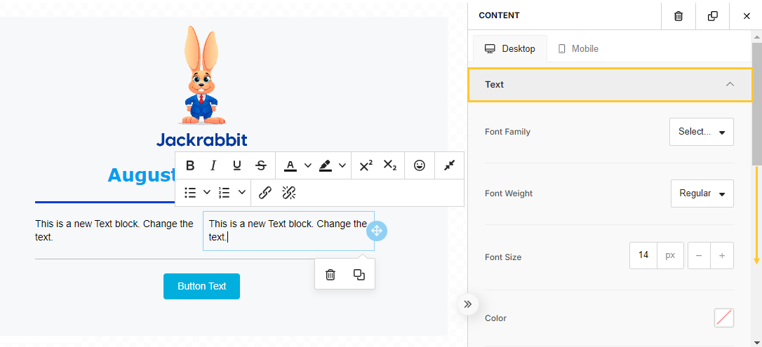
- Add your text in each of the Text content blocks and use the side panel options to adjust the font, alignment, padding, etc. The text editor offers formatting options for further customization.

- Use the side panel options to customize the width, weight, and color of the second Divider content block.
- Customize the button with the call to action text, e.g., Log in to Your Parent Portal. Add the Action Type and use the options for color, width, font, etc. to get the look you want.
- As the final step in customizing your email, go to the Body tab in the side panel. Here, you'll find options that control the whole body of the email rather than each individual block. Some examples are text and background colors, content width (max 900 px), etc.
 |
Make a mistake? Don't panic! Use the Undo and Redo options in the canvas controls (bottom left of canvas) to get back on track! |
Preview and Save Template
Once the email is laid out and you've customized your content, preview the template using the Eye icon in the canvas controls.

Three preset screen sizes allow you to preview your email on Desktop (1280px), Tablet (768px), and Mobile (360px). Many more screen size options are available from the pixel size drop down.

The Audit tab in the side panel displays a red notification badge if there are any issues with your email that should be addressed. Review the issues and make any necessary corrections.
When you are happy with your email, select the Save Changes button. This saves the draft as a template that will be available for use from the drop-down in the email editor throughout Jackrabbit💥!
Note: If a User navigates away from the page when creating the template, the draft is auto-saved and remembered the next time they return. There is no need to save changes to a draft.
Edit a Previously Created Template
The new email template editor is available for creating new templates or editing a template created with that editor. Templates created in the classic editor must be edited using the classic editor editing tools.
Rarely are things ever one and done. Thankfully, editing an email template is simple in the new editor. Start with one design and drag and drop your way to a revamped and revitalized email!
From the List Templates page (Gear icon > Settings > Email Templates), locate the template to be edited and click the link to open the Template Editor.
We've created a template, 100 Newsletter, for you to work with as an alternative to starting from scratch. This template has many rows and utilizes several types of content blocks and column layouts.
Let's step through some edits you can make to customize the template to suit your needs.
Replace Images
To replace an image, you must delete the existing one and then add a new one (there is no option to swap or replace).
- Click on an Image content block to access the image options. Use the Trash Can icon to delete the image.
- From the side panel, drag an Image content block and drop it into the row.
- Click on the Image content block to open the image options. Upload a new image or select a stock photo.
 |
Edit Text Content Blocks
Click on a Text content block to open the text and formatting options. Highlight the existing text and add new. Format as needed.
 |
Delete a Row
Click on a row on the canvas to highlight it and open the row options. Use the Trash Can icon to delete the row.
 |
Delete a Content Block
Click on a content block to highlight it and open the options. Use the Trash Can icon to delete the block.
 |
Reorder Rows
Drag and drop rows in any order. Highlight a row on the canvas to open the row options. Click the Drag icon to move the row to another area and drop it onto the canvas.
 |
 Click here to see this in action (GIF).

